
The Picture above is emphasis which is apart of principles of designs. In class we had to do an assignment on all principles of designs. There are 9 principles of design and emphasis was the the most difficult to make. The most difficult part of the assignment was to line everything up perfectly straight and finishing before class was over.
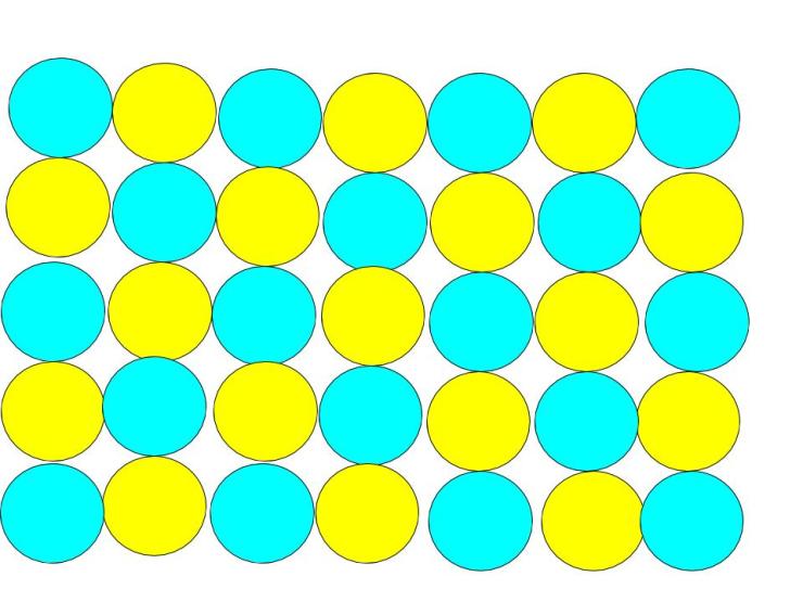
The picture above is a principle of design called pattern. This design was created in google drawings. This was on which we had to show an example of each principle of design. This particular principle of design was hard to make because I had to make sure every circle was lined up and also because I had to keep going back and changing the color of each circle. This assignment took me about 20 minutes to create but I can say that it was an success.
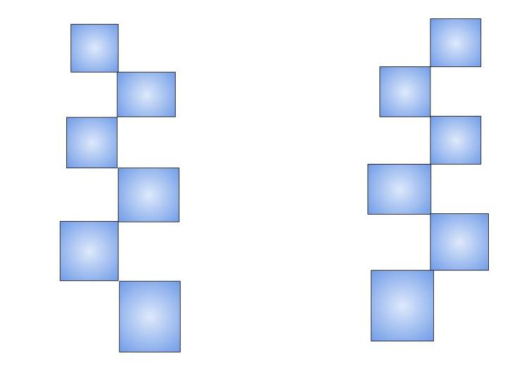
The design you see above is a principle of design which is symmetrical. This design took at least 10 minutes to make but it wasn’t really hard to create. This was the easiest principle of design to create. I like this design because of the color I used. The design you see above was also created on google drawings.
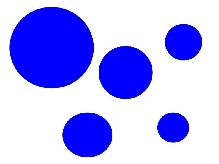
The principle of design you see above is called Harmony. This assignment/ principle of design was very easy to make. The easiest part about this principle of design is picking a shape to illustrate Harmony with and choosing a color. The hardest part was trying to make sure that each circle was uneven. I can Improve on thing to make all of them into circles because one looks like a oval.
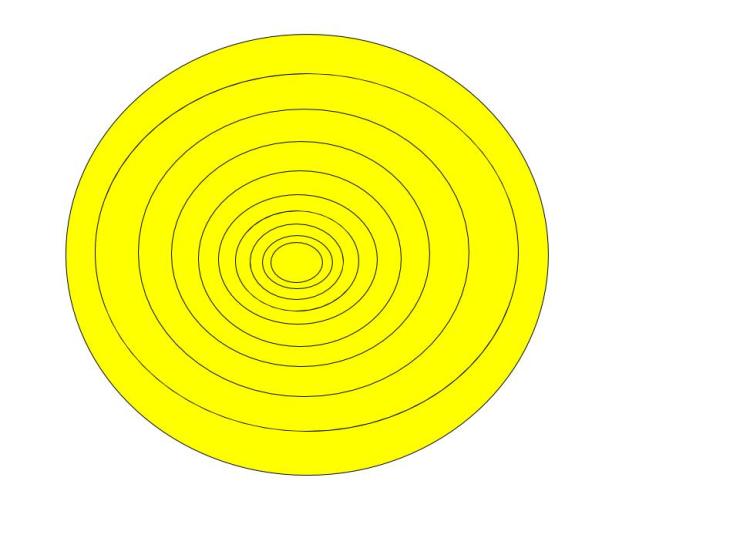
The Design you see above is called movement. The reason this picture is called movement is because the picture looks like the circles are moving down to the end. The Hardest part about this principle of design was getting all the circles lined up and making everting even. The easiest part of this principle of design was making the circles fit inside the other circles but I can improve on trying to make the circles even on the sides.

The design you see above is called rhythm and it is also apart of the principles of design, This picture is called rhythm because the color continues on and the sizes of the rectangles are the exact same size. The hardest part about this assignment was trying to get all the rectangles to fit and make them the same size. The easiest part about the assignment was make the rectangles the same colors. I can improve on trying to get the rectangles edge to edge on the screen.
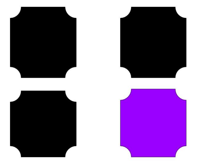
The principles design above is contrast. This picture is called contrast because they have the same shape but the color is different on one. The hardest part about this assignment was lining all the shapes up and making them the same size but mostly keeping the space between even. The easiest part of the assignment was changing the colors but I can improve on making the shapes the same size in height.
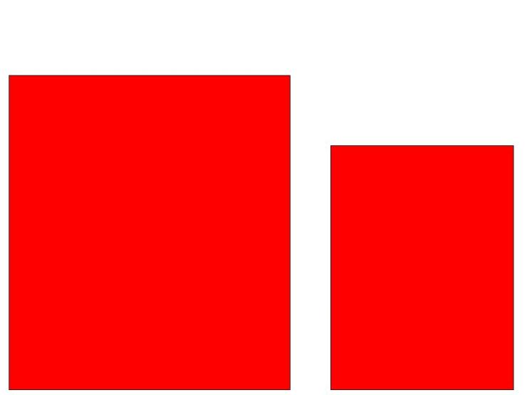
The design above is Called Proportion. This particular principles id designs was very easy to make and maybe a little hard. The hardest part was trying to get the shape on the right to look like a smaller square than the one on the left. The easiest part of this assignment was making the shapes the same color and making them look the same